Re-design the desktop application for EASE from scratch
1

Prioritise and add essential features in the application
2
Create a simplistic platform with intuitive experience
3
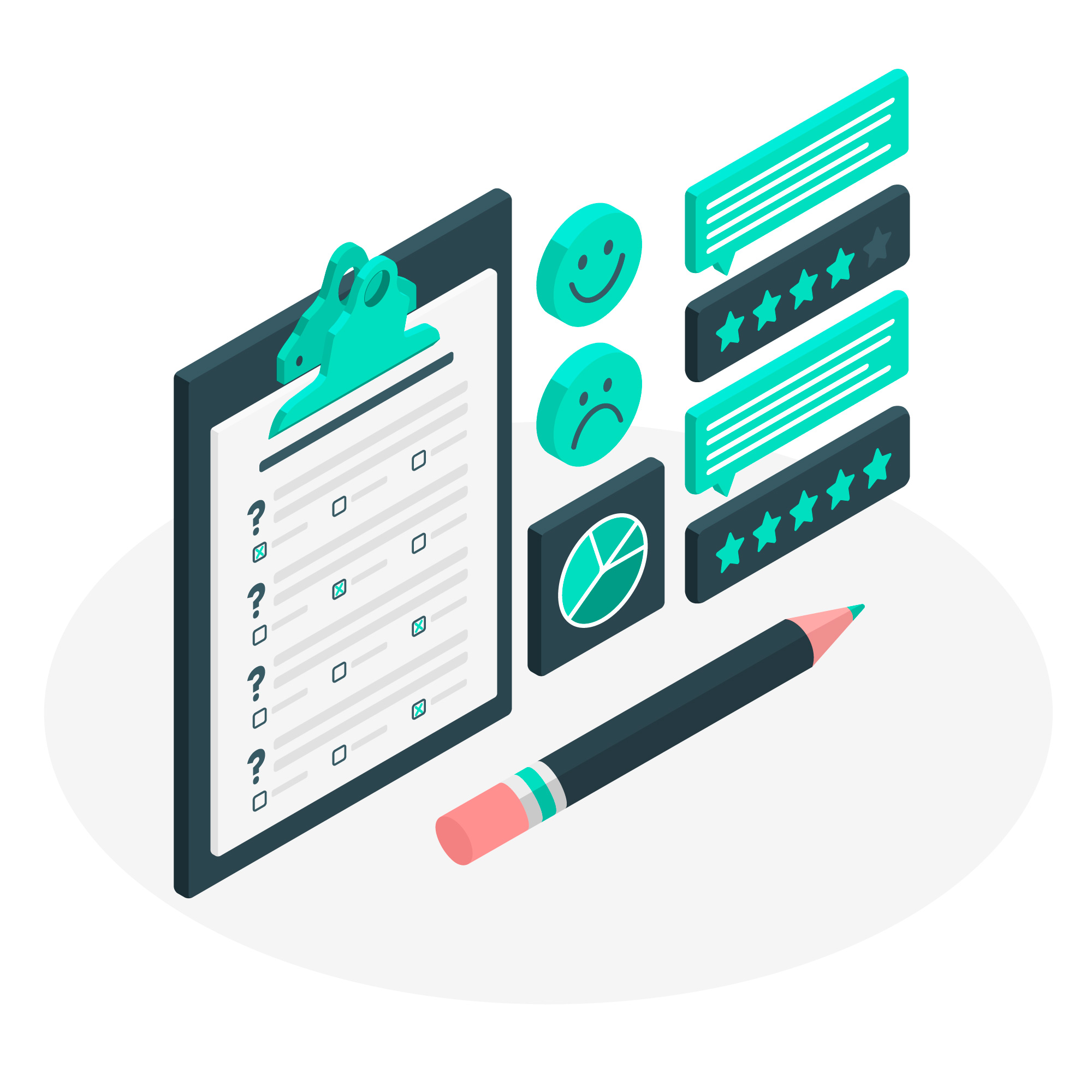
-Non-invasive neuro-modulation device for Depression
EASE by Marbles Health is India's
first-ever non-invasive neuro-modulation device for depression treatment, to be used
as an
adjunctive to medication. The EASE (Executive functioning and Affective
salience through
Stimulation, and EEG) device is worn on the head during treatment. It is
controlled by a
software platform designed to enable remote monitoring. The device specialises in providing
Transcranial Electric Current (tES) stimulation. It also records EEG data
using 4 channels
while the user at rest or performing the task during treatment. EASE is
developed with a
20-session protocol, which includes various cognitive- emotive activities to be
performed by
the patient during the treatment.As the lead UX designer, I re-designed the software
platform (for tablets/desktops) for EASE device, to be used by the medical
professionals.
Duration: March 2023- April 2023
My Role: UX Designer | UX Researcher
Deliverables: User Research Notes | User Journey Maps | Design Wireframes |
Mockups and Prototype
Re-design the desktop application for EASE from scratch
Prioritise and add essential features in the application
Create a simplistic platform with intuitive experience
Define
Defined project scope; pain points; created user persona

Ideation
Facilitated the brainstorming sessions
Prototype
Created wireframes, iterated on designs post discussions with the psychiatrists
Usability Study
Tested our prototype with our user base
Final Design
Revamped the designs based on usability testing
Unlike the Marbles Brain Health application, the EASE headband was already developed and in trials. The developed software application was very basic. My role as UX designer was to re-design the software platform with a flawless user experience for our users i.e. medical professionals, who are often not very advanced in technology.
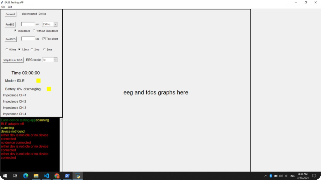
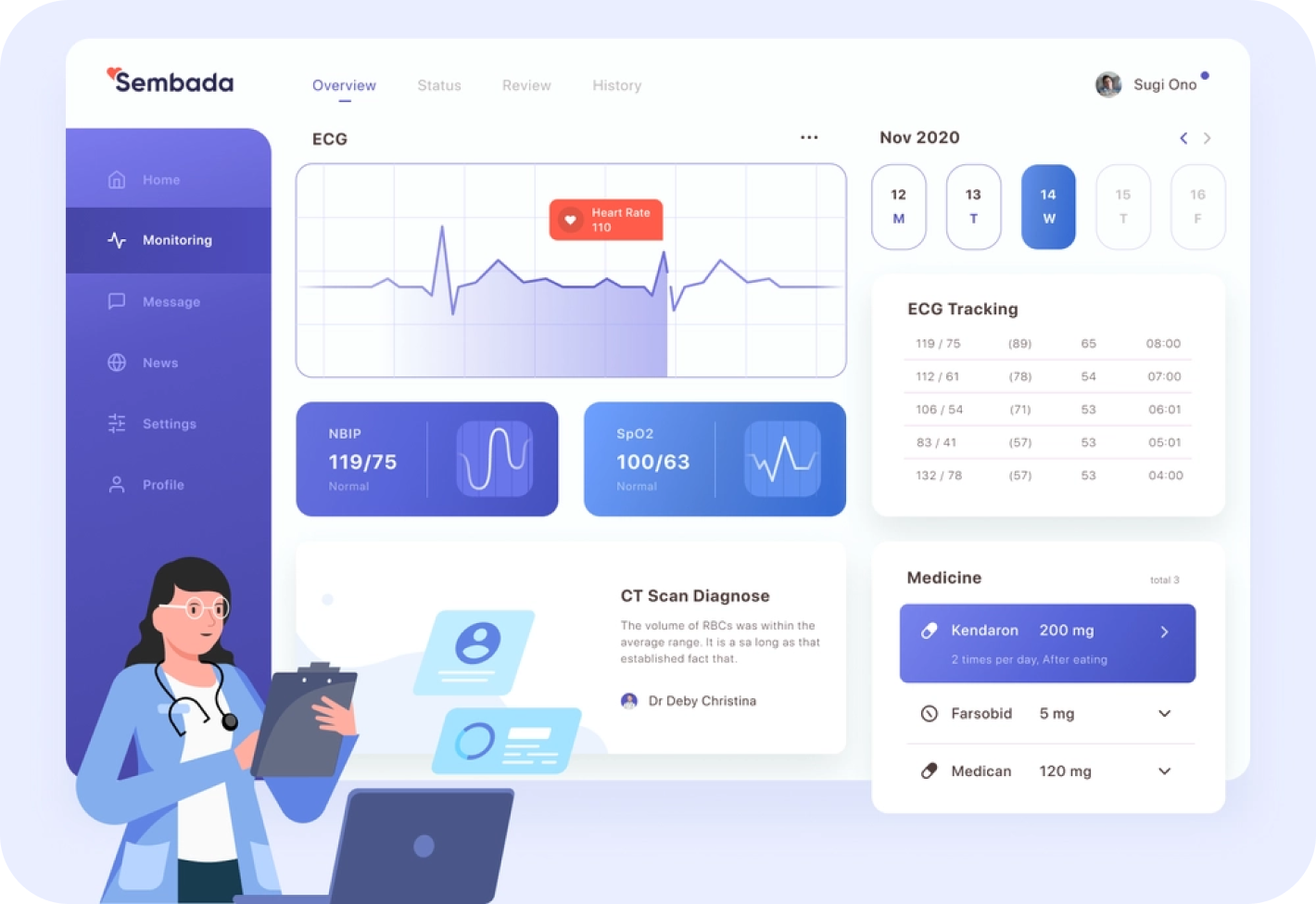
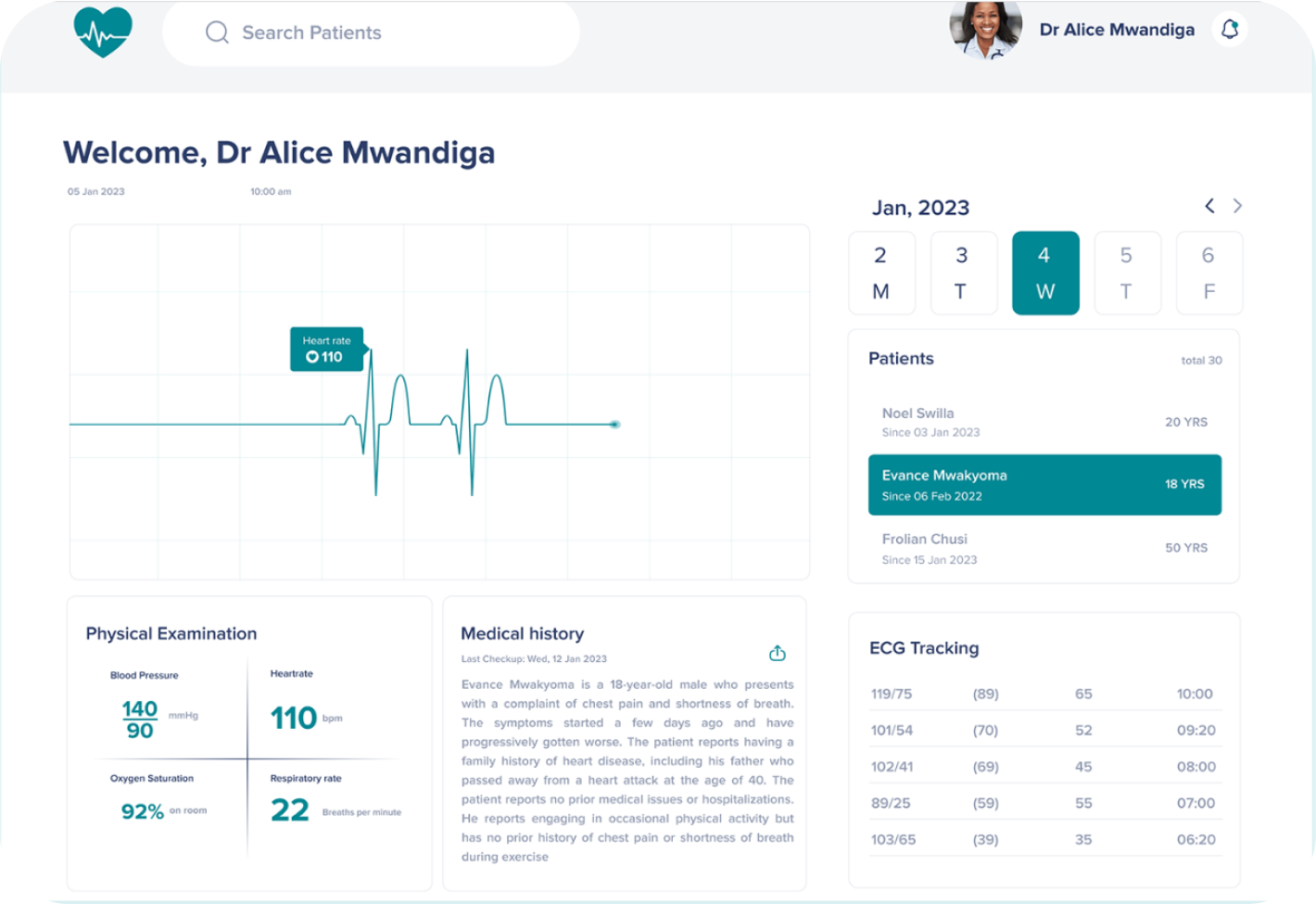
Functional EASE Platform Designs
Some major features to be included in the platform were:
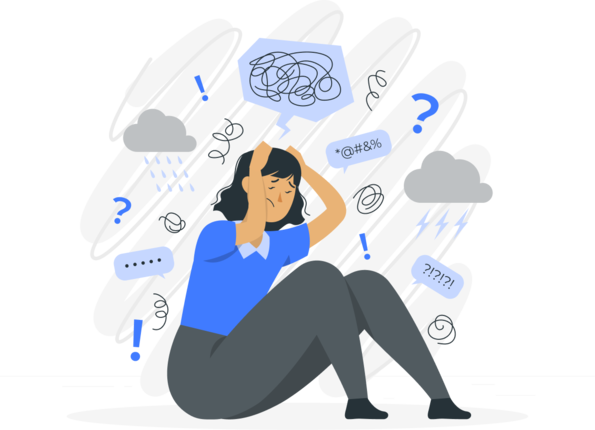
Pain Points
For the first version of our headband, our users were psychiatrists who will use the
EASE headband on their patients for treatment of depression. After going through the
collected user research data, I came up with with one user persona and several pain
points.
Screen functions not clear
Users could not understand how to begin or end the experiment
Several features missing
Users did not know how to pause or stop the session
Ambiguous information
EASE protocols were not comprehensible through the platform
Unable to find results
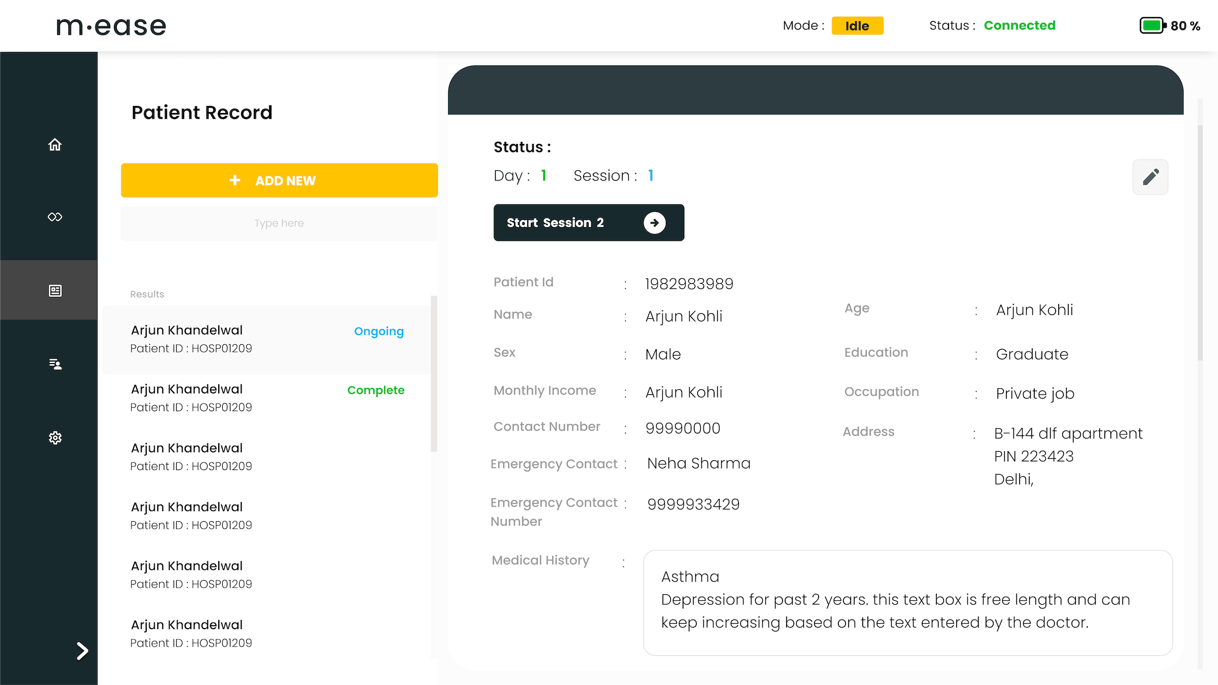
Users were unable to access the progress and experiment data easily
“I really like the EASE model however the platform is hard to follow.”
Name: Dr. Lakshay Singh
| Age: | 48 years |
| Sex: | Male |
| Education | Psychiatrist |
| Hometown: | Delhi, India |
| Family: | Parents, younger sister |
| Family Income: | 40 lac per annum |
| Occupation: | Working at Govt. Hospital |
Goals
Frustrations
Lakshay is a psychiatrist working at AIIMS Hospital, Delhi. He has over 20 years of experience and has recently started using the EASE device with his patients. Since conventional treatments do not include much computer use, his knowledge of applications is average. A complex platform will be hard to grasp and follow, which can hamper the treatment of his patients.
User Persona: Lakshay
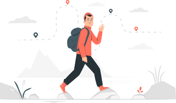
User Flow
Given all the information and new features to be included, I created a new user flow.

User Flow
Mood Board
There are only a few products in the market which are similar to our headband. This made our
task challenging to create the mood board. Thus, I searched for any medical platforms which
display tDCS graphs, EEG data for inspiration to design our platform.
Mood Board
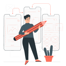
Wireframes
Based on our user flow, I divided the application into different features. I created
wireframes keeping the application features in mind.
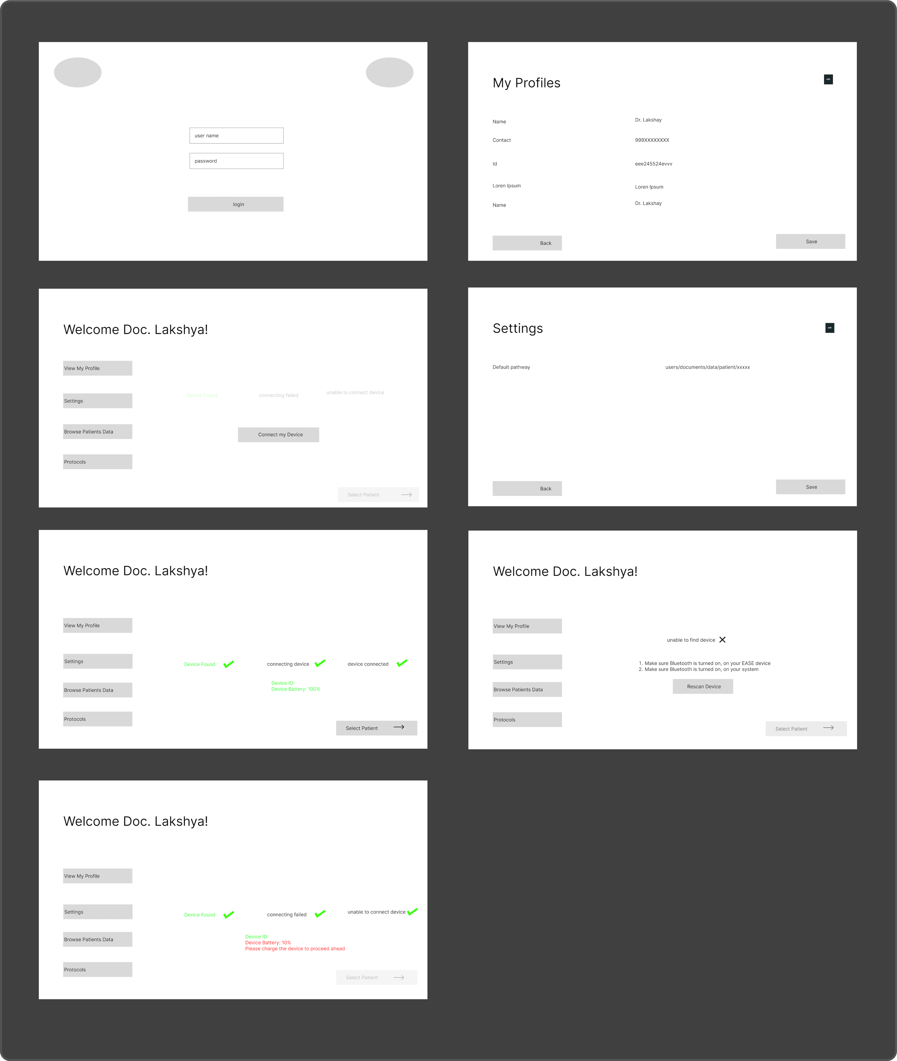
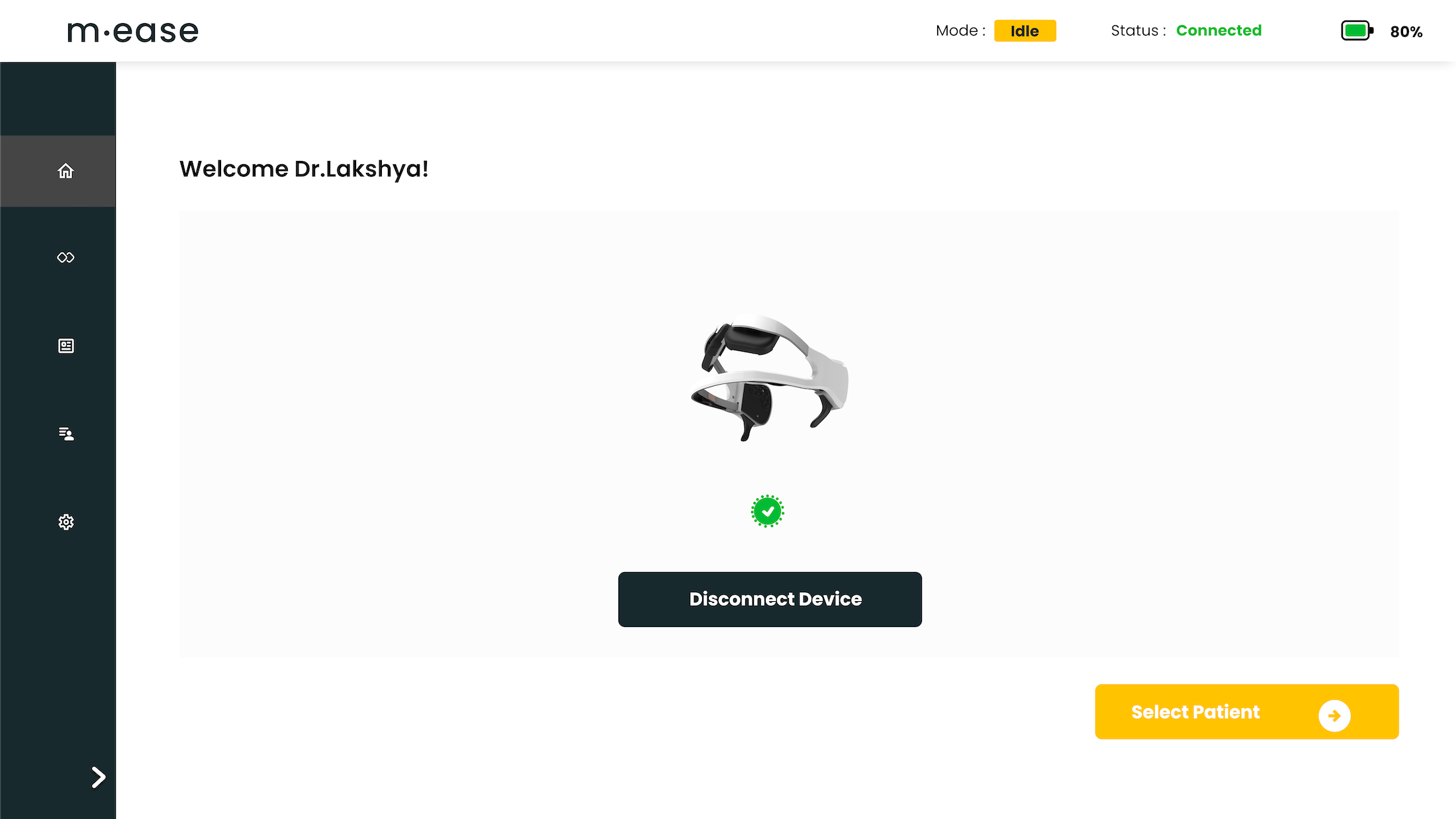
Login Section
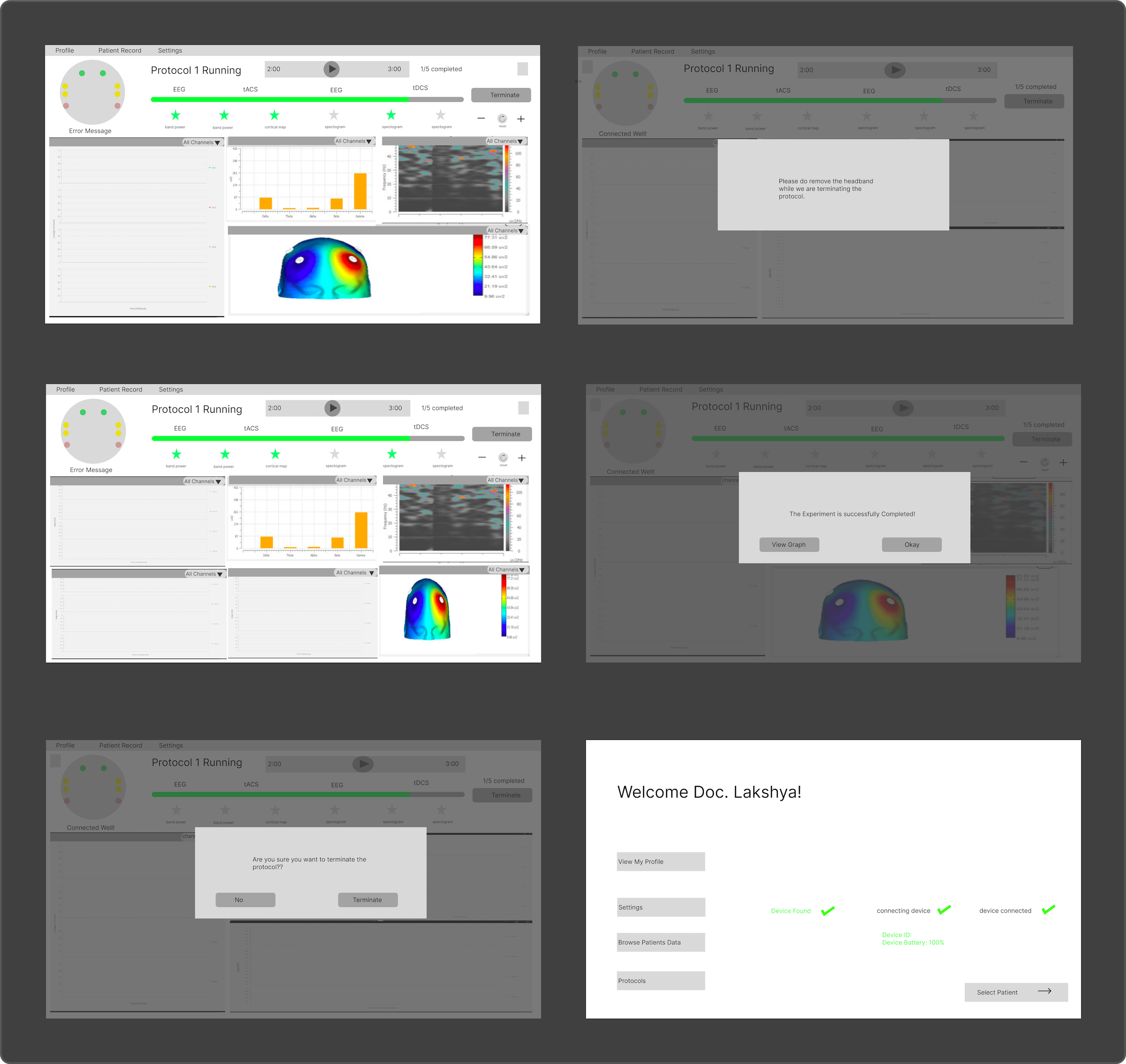
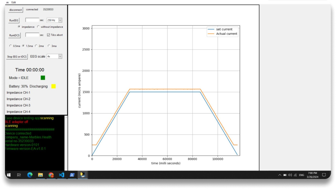
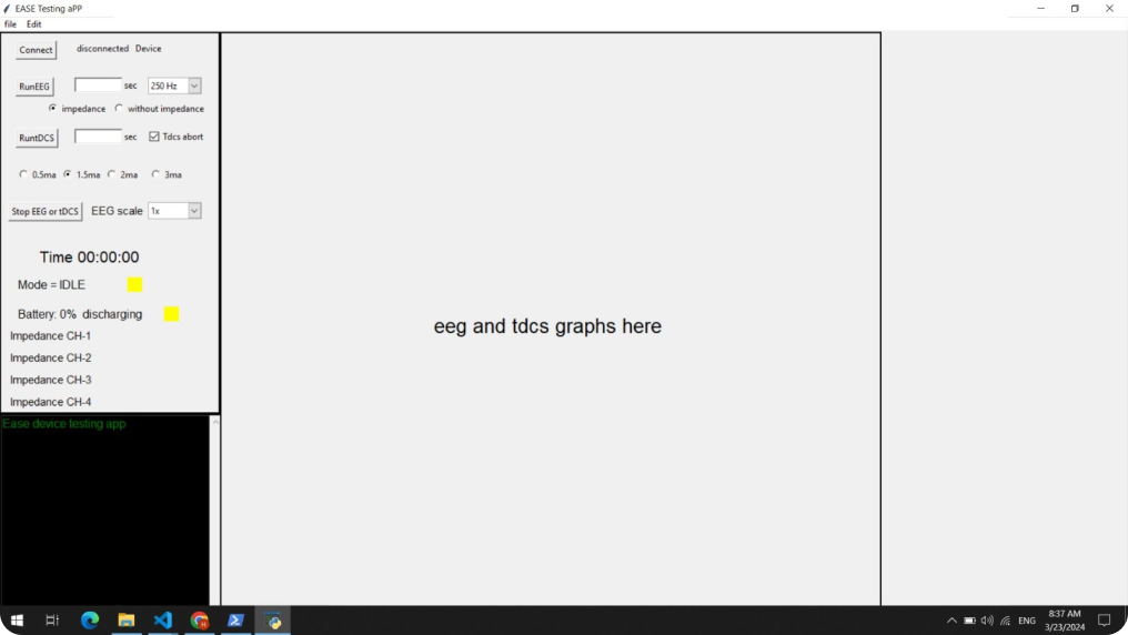
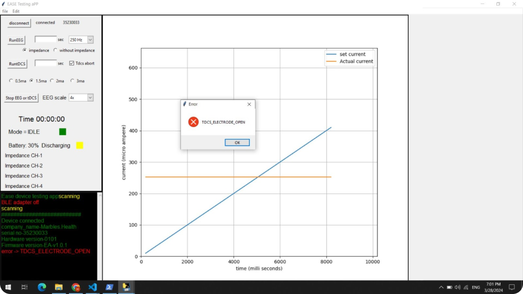
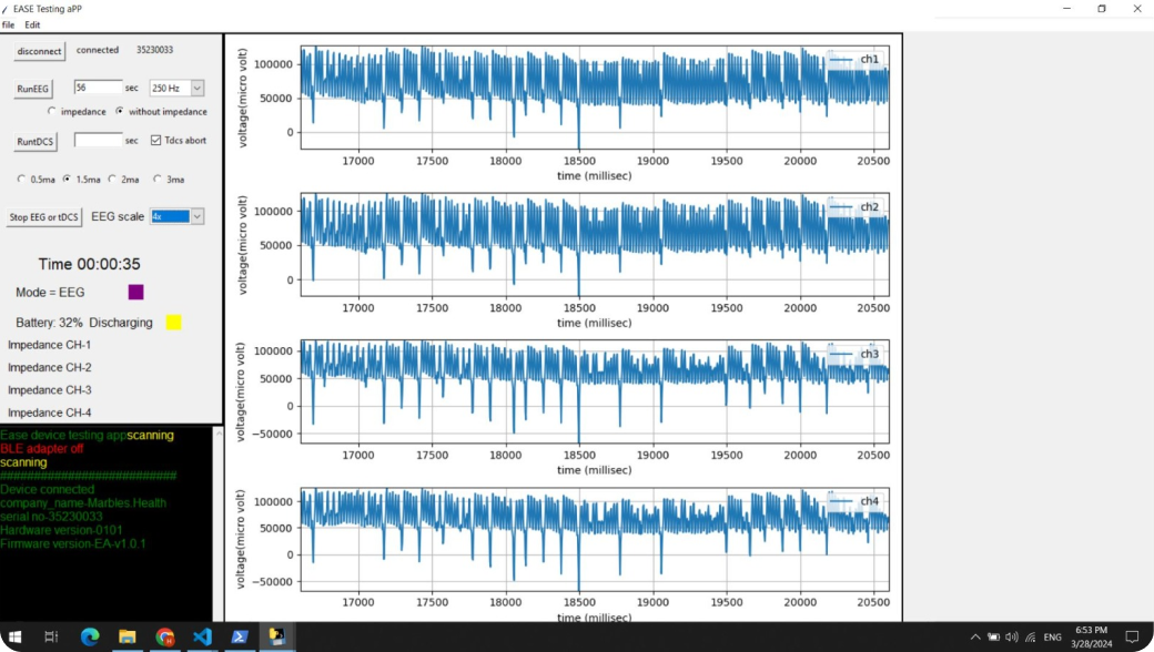
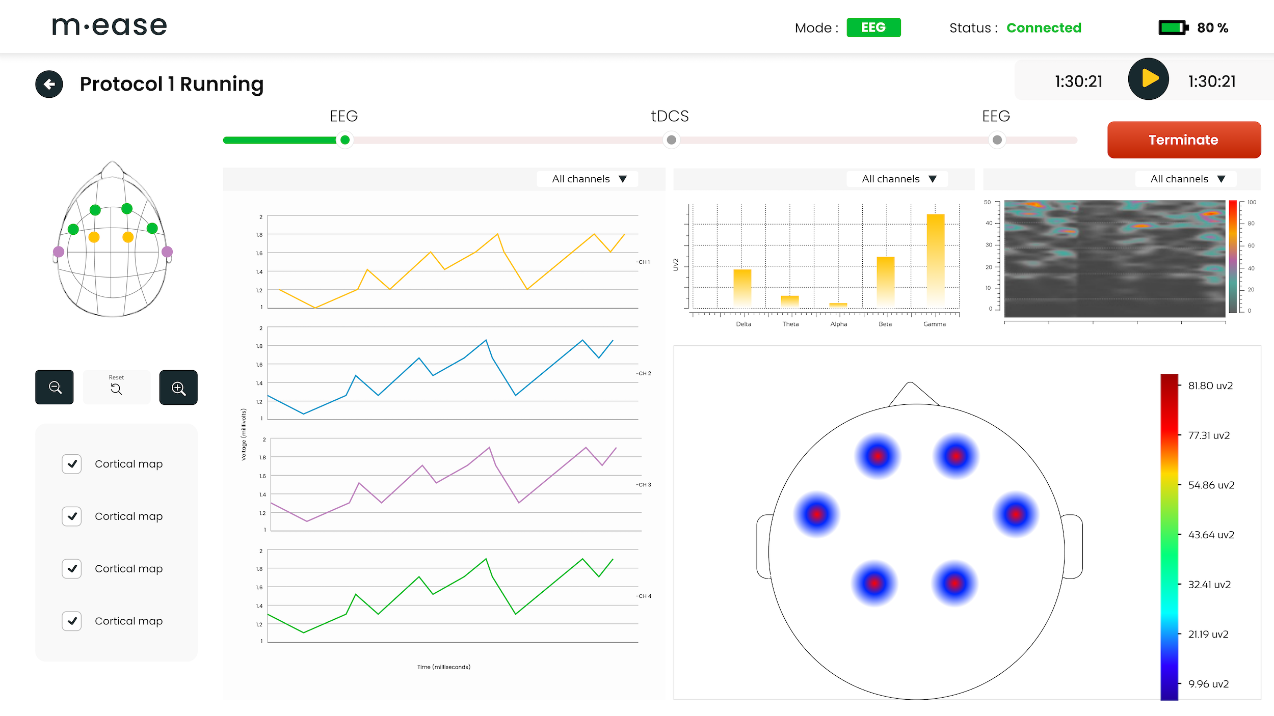
tDCS, EEG Screens
Mockups
After completing the wireframes, I moved on to create the mockups to further develop the
design concept. This involved adding detailed visual elements such as color schemes,
typography, icons, and images based on our brand playbook. I ensured that the mockups
accurately reflected the intended look and feel of our EASE platform.
Usability Study
I narrowed down potential features and created a prototype for our usability study.
Given
our user base, we found it hard to get time from many doctors to test our prototype. Thus,
we conducted the study with 3 users. We conducted our usability study in the hospital where
our pilot studies were conducted. Users were asked to use the prototype based on the prompts
given by the moderator. Later, we sent a system usability scale for rating.
Goals:
Primary Research Questions:
KPIs:
Findings and Iterations
Post the usability testing, we re-iterated on the platform design to resolve any pain points
that came up during our user testing and create a flawless user experience.
Key Finding 1
Users were not able to recognise the navigation icons easily. I reiterated the designs and finalised adding a collapse/expand icon in the navigation bar, which displays the option names. We had also considered using a hover to expand the navigation. However, it felt more confusing to the users, interrupting their attention from the main screen.
Key Finding 2
EASE treatment protocol was pre-installed on the platform when users installed it. It was a 10+2 days treatment protocol with 2 treatment sessions everyday. Our users did not understand the EASE treatment protocol well. They also found it hard to browse through 10-day session data and understand the next session. Users could also not view the complete 20 session details in one go. To resolve this issue, I used more visuals to create a better protocol section explaining the sessions and information regarding the 20-session treatment protocol.
Key Finding 3
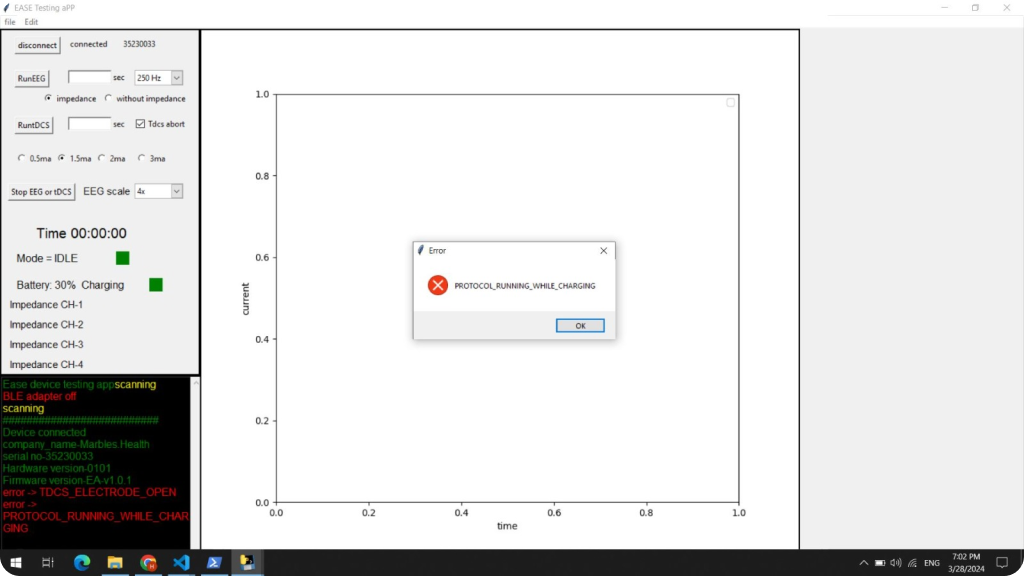
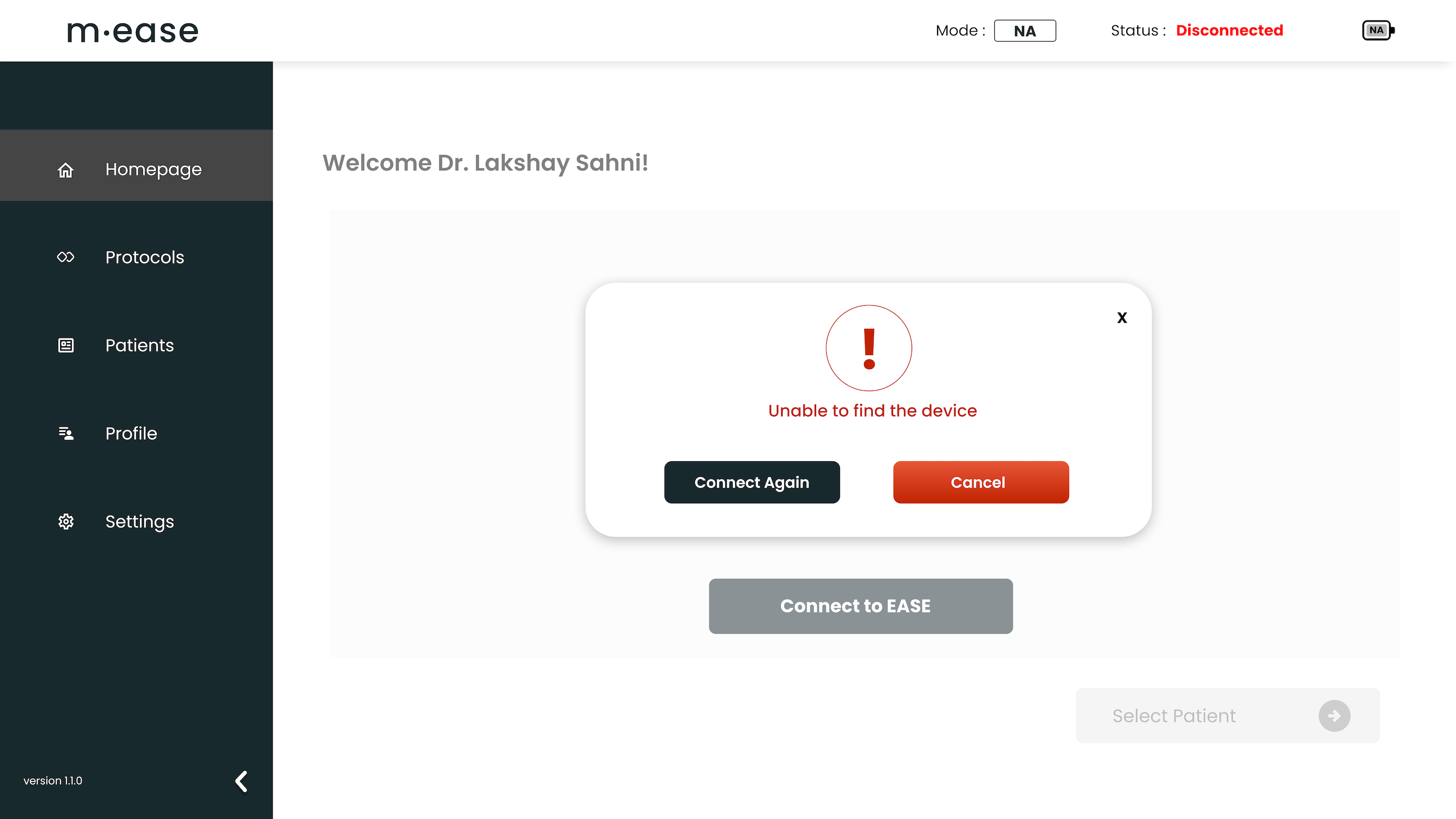
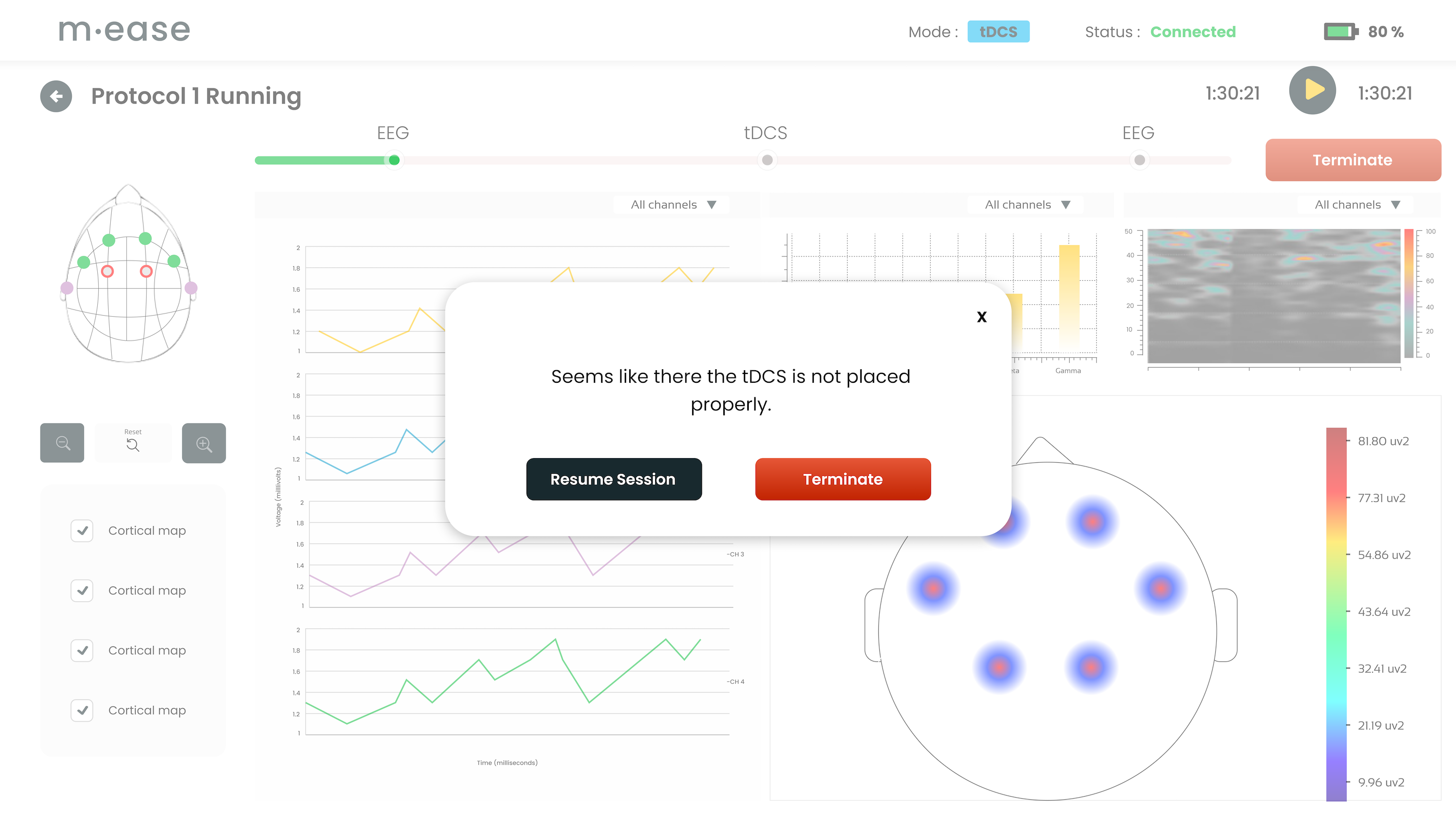
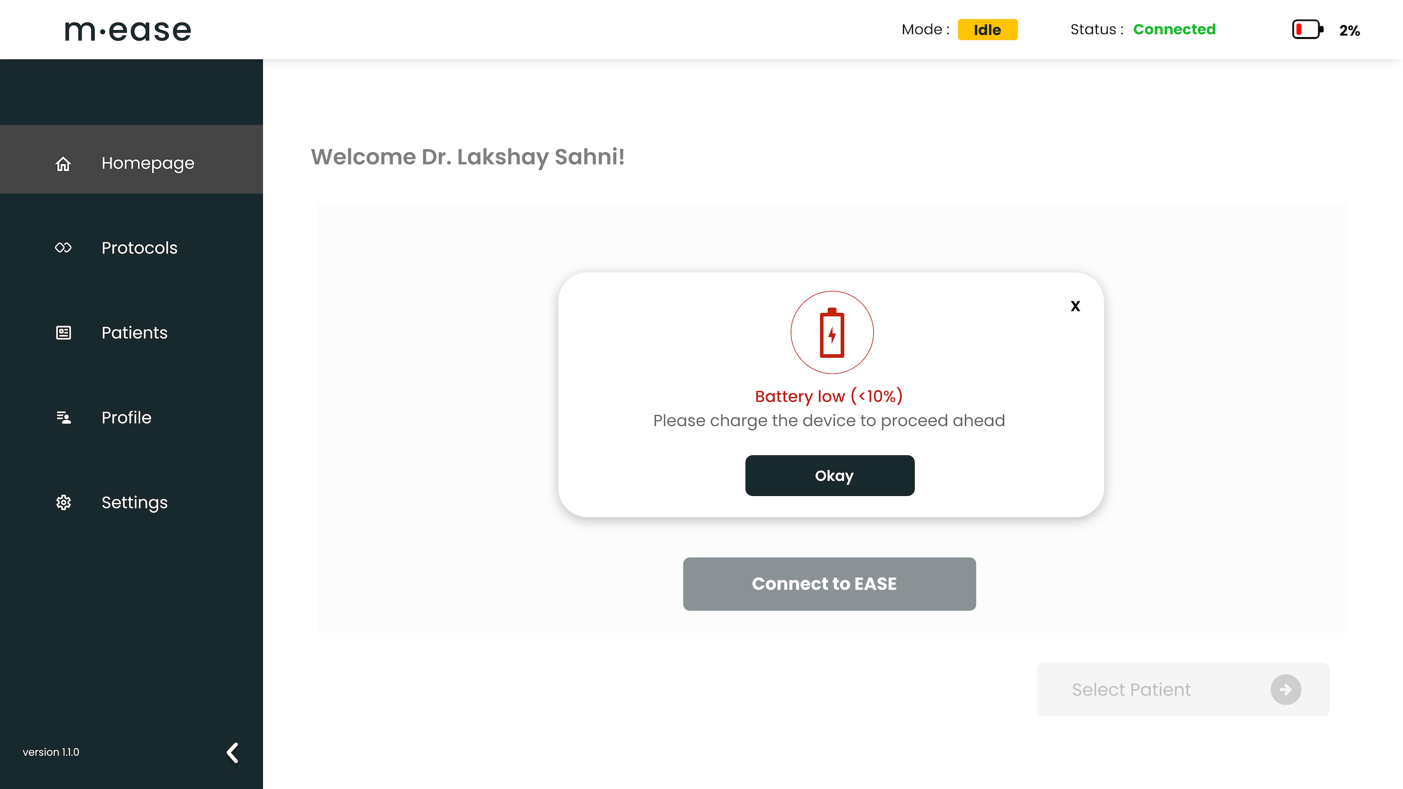
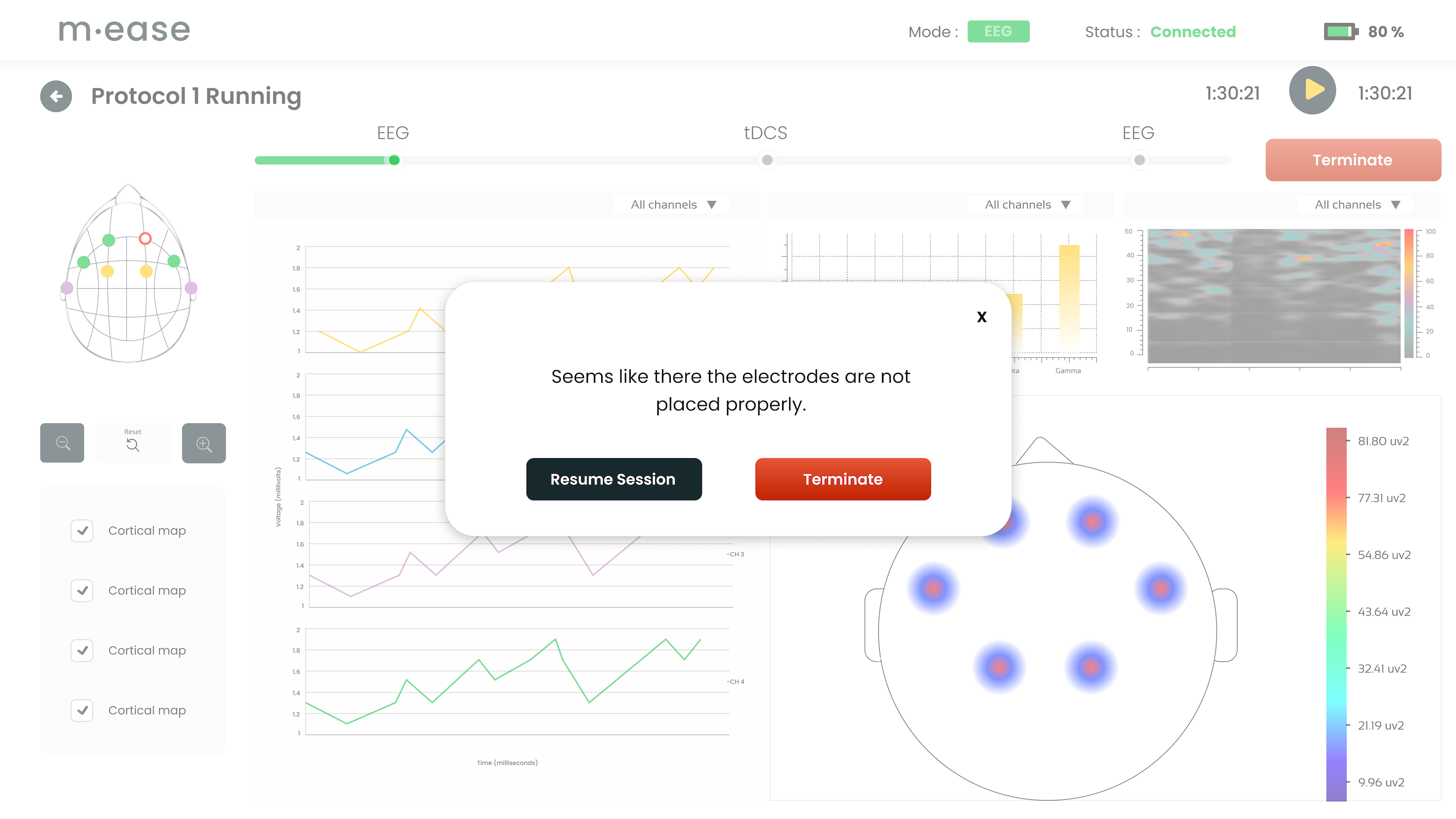
We had initially not covered many edge cases, such as bluetooth disabled in device or laptop; application crashing; laptop battery dead. So, we considered all the edge cases to the best of our capacity and added those in the final application.
Key Finding 4
Users wanted to explore the platform while the session on a particular patient was being run. At the same time, they wished to view the current status, implying the need of our user base to keep switching between tasks while the main task of the experiment was undergoing. We cater to this pain point, we added a mode section to our design that displayed idle, connected, tDCS or EEG at the top. This feature made it easy for the doctors to explore the platform while simultaneously monitoring the experiment.
After multiple iterations, our final design came out to be sophisticated, simple, and user-friendly! We resolved the major pain points that we began our design with. We also implemented the findings from the usability study in our new iterations. As per the user feedback, the doctors found it easy to understand the application features, find the patient information, and navigate the platform. The biggest challenge I faced in the project was team management. The project gave me opportunity to work on my leadership skills, as I was responsible for timely implementation and delivery of the product. Heading a diverse cross -functional team of developers, industrial designers, psychologists and copywriters, I was able to deliver the designs in 3 weeks, and the complete platform was ready to use in only 2 months instead of originally planned 3 months.